Imagine that a poster is like a trailer of a movie. Short, crisp and exciting with just enough details to reel in your audience. Plot twists are allowed in posters in contrast to movie trailers.
Scientists and students at many levels present a poster at some point in their career. Graduate students may be required to present posters at conferences in their research fields, which add valuable experience sharing their research. While undergraduate students may not get as many chances to present posters, students who take research either for experience or for credits get a chance to present a poster at least as part of undergrad-specific conferences at their universities. Professors present research as posters less frequently, but can occasionally be seen presenting at some conferences, retreats, and other events. So we all present posters at some level of our scientific career, and need to develop skills to design and present a "good" poster. Here I outline some tips to design a successful science poster.
1. Big fonts and images
People passing through the poster area should be able to read your title and key figures without having to come closer to you through the crowd.
Make your poster title and text big enough for someone to read it from a few feet away.
Use a short, crisp title that fits in one line.
Use legible fonts, be consistent in use of fonts throughout the poster (maximum two types of fonts: one for headings and one for the body text).
Avoid Comic Sans.
2. Less text
A poster is a visual tool to present your work. Long running texts make your poster dull for an onlooker.
Avoid too much text (or any text at all) except for your figure captions.
If there are points to be conveyed through text, use bullets instead of paragraphs.
3. Poster ≠ paper
Sometimes, we might have written a paper on the same topic ready for submission. The figures made for a paper may not be suitable for a poster, so simple pasting all the figures from the paper on to your poster will results in too much information for you to explain to your audience.
Pick highlights from your paper and present only those.
Make cartoons to convey important points that were discussed using text in the paper.
If you made a 'table of contents' graphic for your paper, use it in your poster intro.
4. Negative/white space
Try not to cram everything in your poster. The layout of the poster can be designed to help the reader follow your research story.
Leave enough white space between sections and figures so the reader can easily follow your story.
Split different sections of the work into different columns, and add subheadings to point the reader to specific parts of the story (examples: Concept/design, hypothesis, results, key takeaways, future directions).
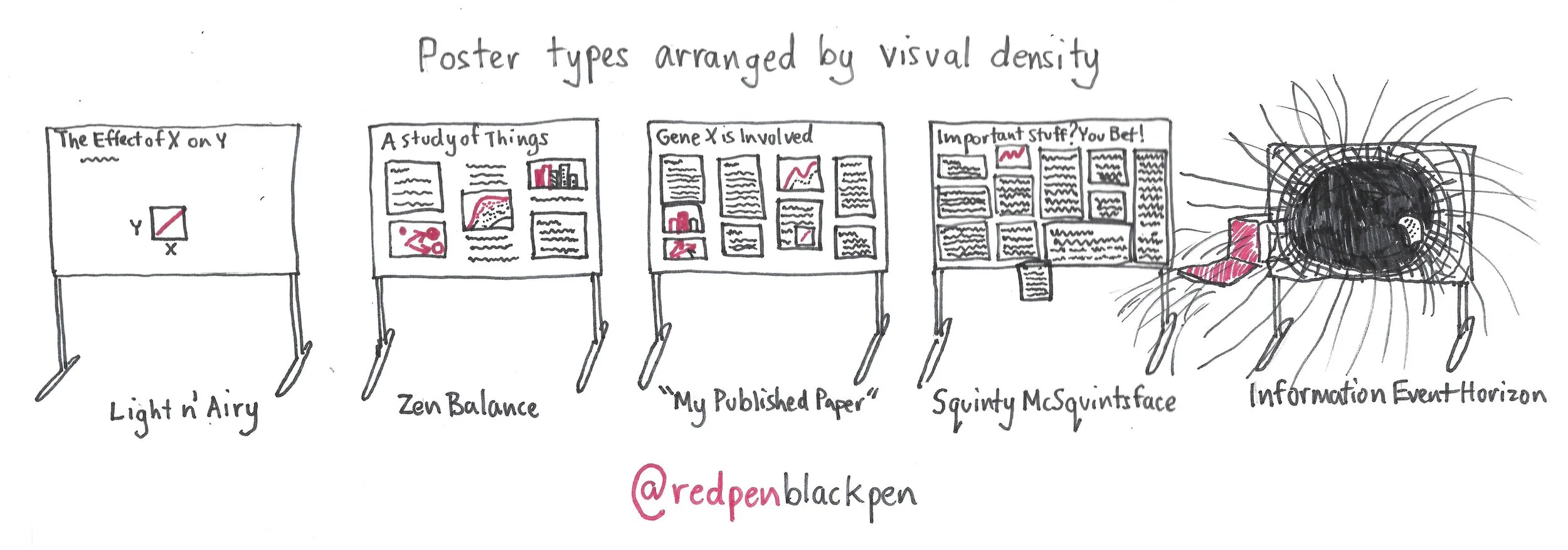
This cartoon by twitter-famous RedPen/BlackPen illustrates the different types of posters one might see at conferences.
5. Color scheme
While you can choose any color for your poster, you should be considerate of your audience. As a partially colorblind person, sometimes I have found myself struggling to understand data with similar colors.
Choose a color palette with distinct colors (especially for figures and graphs).
Identify a color combination that will help colorblind people to easily understand your results (eg: avoid green and orange in the same graph).
6. Graphics
Make cartoons to explain key concepts or results in your poster. The audience will understand it better than text with hundreds of words, given the short time they will hover your poster.
Use a "graphical abstract" similar to what you make for journals when you submit your paper.
Use this on the top panel along with your title or introduction to hook audiences.
7. Design vs timing
Overall, design your poster so that you are able to explain it to the passer-by in 3-4 minutes. If you have more information than you can explain in 3 minutes, it's time to cut some things out from your poster.
8. Preparation time
A good poster takes time to make.
Start well in advance and add whatever pieces of results you think are related on the poster.
Then organize data and eliminate or add information.
Spread out your preparation time so you can work and reflect on your poster, then work on it again and reflect.
To keep my poster to the point, I think of this quote by Antoine de Saint-Exupery:
Perfection is achieved, not when there is nothing more to add, but when there is nothing left to take away.
Have fun making a great poster!
